Color Theory for the Home: How to Choose Paint That Feels as Good as It Looks
A Homeowner’s Guide to Harmonious Color Design from Ashby Lumber
Choosing paint color isn’t just about what looks trendy—it’s about how a space feels. Whether you’re refreshing a single room or reimagining your entire home, understanding color theory can help you build an environment that reflects your personal style and supports how you live.
At Ashby Lumber, we’re here to help Bay Area homeowners make smart, beautiful design choices. From your first paint swatch to your final finish, we’ll guide you every step of the way.
What Is Color Theory?
Color theory is the foundation of good design. It’s the art and science of how colors interact, and it can help you:
- Create flow between rooms
- Choose tones that fit the mood of each space
- Highlight architectural features
- Balance bold and subtle choices
The basic color wheel includes primary colors (red, blue, yellow), secondary colors (green, orange, purple), and tertiary blends like teal, coral, or olive. By understanding how these relate to one another, you can create more cohesive and impactful interiors.
How to Build a Whole-Home Color Palette
Instead of picking one color at a time, take a step back and plan your whole-home palette. Here’s how:
1. Pick a Base Color
This could be a soft neutral or a muted color you love—something that can work in most rooms. Think of it as your design anchor.
2. Choose Supporting Tones
Use analogous colors (next to each other on the color wheel) for a calm, connected feeling. Or introduce complementary colors (opposites) for contrast and energy.
3. Balance Warm and Cool
Warm tones (like terra cotta or mustard) feel cozy and lively, while cool tones (like sage or sky blue) create calm. A mix of both keeps your home feeling dynamic and lived-in.
4. Consider Light and Sheen
Natural light can shift how a color appears. Soft sheens can brighten darker hues, while matte finishes add subtle depth to walls.
Color by Room: What to Use and Why
Each room in your home has a purpose—and your color choices should support that.
Living Room
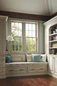
Choose mid-tone or earth-inspired colors to create warmth and welcome. A monochromatic look with varied textures can feel elegant and timeless.
Kitchen
Color can energize this space. Try pairing light wall paint with darker cabinets or vice versa. Two-tone color palettes are trending for a reason—they offer contrast and flexibility.
Bedroom
This is your sanctuary. Stick to softer shades like blue-gray, muted lavender, or sage green to encourage rest and relaxation.
Bathroom
Play with contrast here. Bold vanity colors like charcoal or navy pop against white walls or tile. In smaller spaces, even dark walls can feel cozy and luxurious.
Entry and Hallways
Don’t overlook transitional spaces. A warm, neutral or moody tone here sets the tone for the rest of your home.
Exterior
Earth tones blend with landscaping, while bold trim or front door colors make a statement. Make sure to test colors in natural daylight before committing.
Visit Ashby Lumber for Expert Help
Not sure which hues work with your cabinetry, countertops, or lighting? Our Kitchen & Bath Showroom team can help you build a full-material palette, from paint to hardware. Want a visual mockup? We use 2020 design software to show you what your spaces can look like—before you even open a can of paint.
Call our showroom team at (510) 616-5154 to speak with a design expert or book a consultation.
Want to test your color instincts first? Play our fun color-matching game here and see how well you can build a harmonious color palette.
Let Ashby Lumber Help You Color with Confidence
For over 50 years, Ashby Lumber has helped Bay Area homeowners make thoughtful, beautiful home improvements. Whether you’re tackling one room or a whole-home transformation, we’re here to support you with quality materials, custom design help, and knowledgeable service.
Visit www.ashbylumber.com to explore design tools, browse materials, or get started on your next project.